LA Fitness: Sales Management Tool
The Challenge
Sales representatives spent 15-20 minutes explaining plan details to each potential customer due to:
- Information scattered across dense tabular layouts
- Lack of visual hierarchy in plan features
- Disconnect between internal tool requirements and customer-facing needs
- Poor continuity in plan comparison workflow
Research Insights
User Analysis
- Conducted interviews with sales representatives
- Identified most frequently requested plan information
- Mapped common customer decision points
- Analyzed pain points in the sales process
Key Findings
- Customers primarily focused on:
- Sales reps needed to:
Design Process
Initial Solution
First iteration used popup windows to display additional plan information. This approach failed because:
- Users lost context when comparing multiple plans
- Popup overlays disrupted the natural flow of conversation
- Screen navigation became cumbersome
Refined Solution
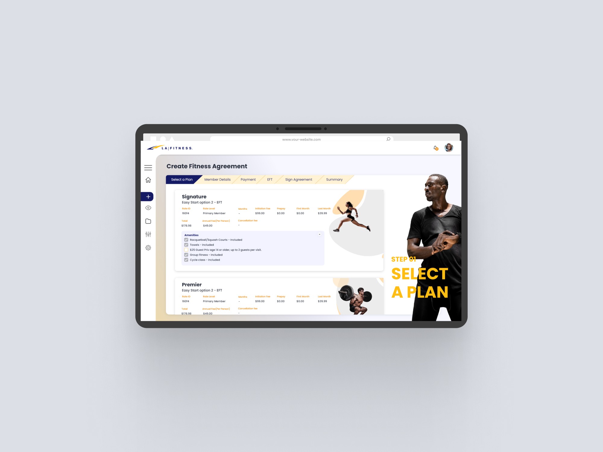
Developed an accordion-based interface that:
- Prioritizes essential information in the main view
- Provides expandable sections for detailed features
- Maintains visual context during plan comparison
- Aligns with LA Fitness's energetic brand identity
Information Hierarchy
Prioritized information based on:
- Core plan features and pricing (always visible)
- Frequently requested details (one-click access)
- Supplementary information (nested in accordions)
Impact
Immediate Results
- Reduced plan explanation time
- Decreased follow-up questions from customers
- Improved sales process efficiency
- Better alignment with brand aesthetics
User Feedback
Sales representatives reported:
- More confident plan presentations
- Easier access to relevant information
- Better customer engagement
- Smoother sales conversations
Key Learnings
- Information architecture should support natural conversation flow
- Visual context is crucial for complex decision-making
- Internal tools need to consider customer-facing scenarios
- Brand energy should be reflected in UI interactions
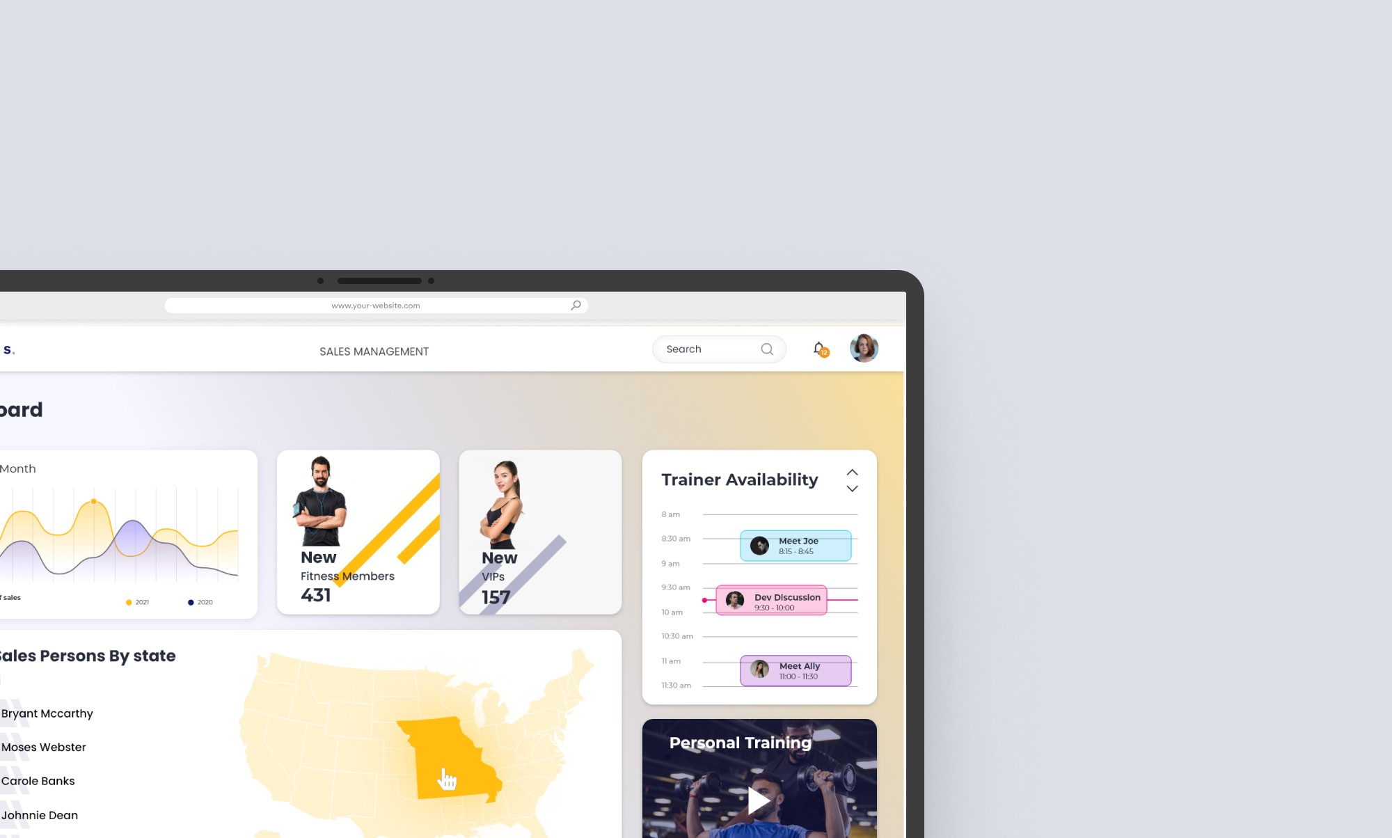
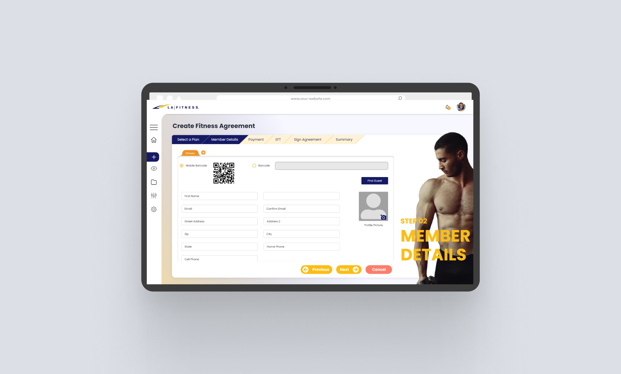
Redesigned LA Fitness's sales management tool to streamline membership plan presentation and improve sales efficiency. The project focused on transforming complex tabular data into an intuitive, accessible interface for both sales representatives and potential customers.
The Challenge
Sales representatives spent 15-20 minutes explaining plan details to each potential customer due to:
- Information scattered across dense tabular layouts
- Lack of visual hierarchy in plan features
- Disconnect between internal tool requirements and customer-facing needs
- Poor continuity in plan comparison workflow
Research Insights
User Analysis
- Conducted interviews with sales representatives
- Identified most frequently requested plan information
- Mapped common customer decision points
- Analyzed pain points in the sales process
Key Findings
- Customers primarily focused on:
- Sales reps needed to:
Design Process
Initial Solution
First iteration used popup windows to display additional plan information. This approach failed because:
- Users lost context when comparing multiple plans
- Popup overlays disrupted the natural flow of conversation
- Screen navigation became cumbersome
Refined Solution
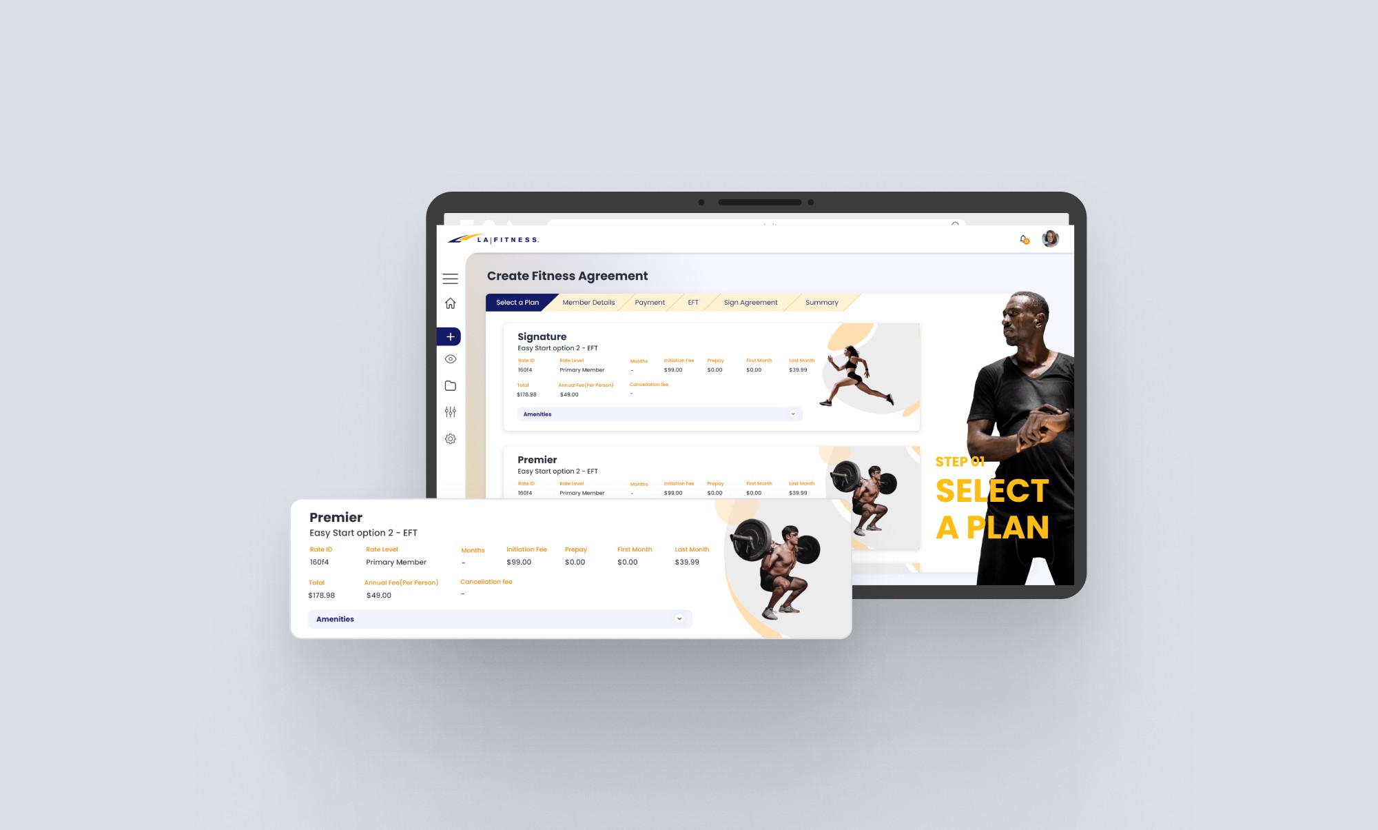
Developed an accordion-based interface that:
- Prioritizes essential information in the main view
- Provides expandable sections for detailed features
- Maintains visual context during plan comparison
- Aligns with LA Fitness's energetic brand identity
Information Hierarchy
Prioritized information based on:
- Core plan features and pricing (always visible)
- Frequently requested details (one-click access)
- Supplementary information (nested in accordions)
Impact
Immediate Results
- Reduced plan explanation time
- Decreased follow-up questions from customers
- Improved sales process efficiency
- Better alignment with brand aesthetics
User Feedback
Sales representatives reported:
- More confident plan presentations
- Easier access to relevant information
- Better customer engagement
- Smoother sales conversations
Key Learnings
- Information architecture should support natural conversation flow
- Visual context is crucial for complex decision-making
- Internal tools need to consider customer-facing scenarios
- Brand energy should be reflected in UI interactions
Final Thoughts
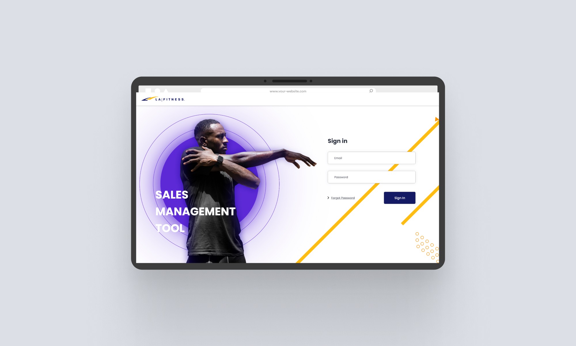
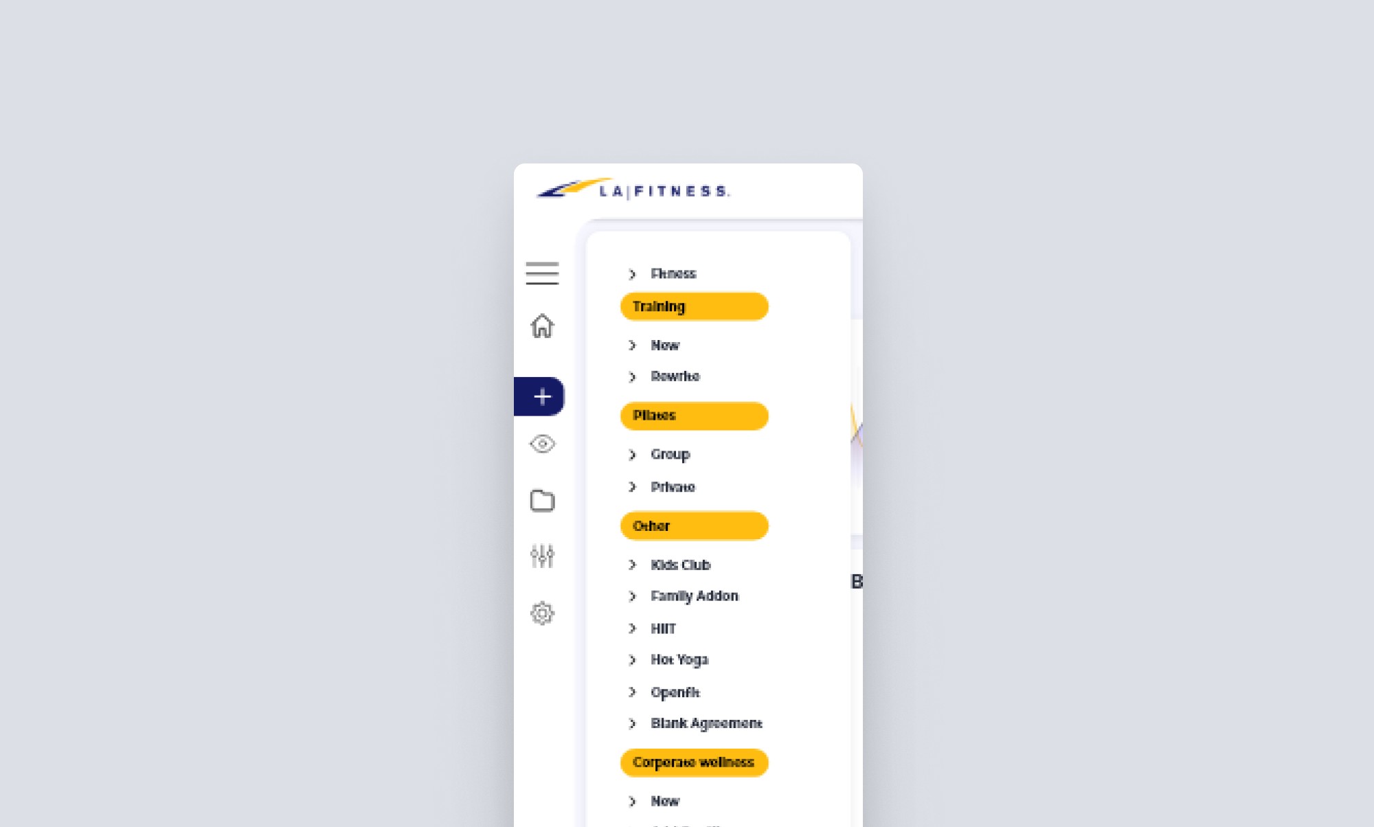
By restructuring how plan information is presented, we created a more efficient sales tool that serves both internal and customer-facing needs. The project demonstrated how thoughtful information architecture can significantly impact business processes and user experience.