Cachē
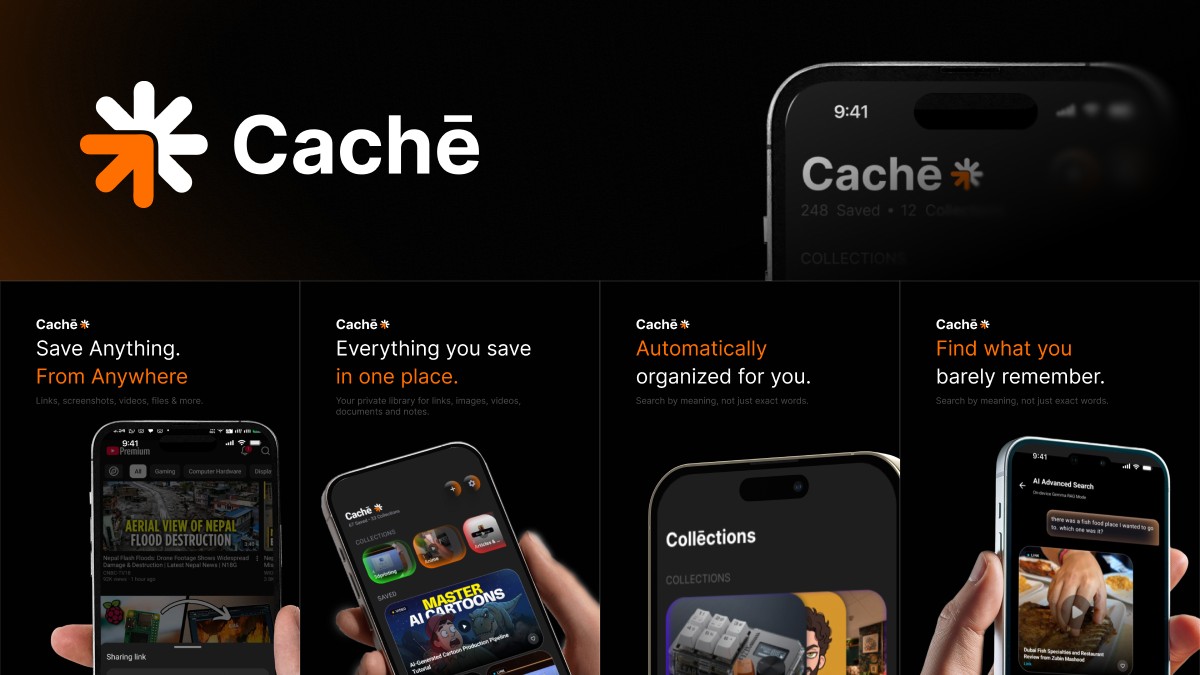
Cachē is where I put the things I mean to find again. A reel, a link, a screenshot, a note. I share it from the app I am already in, the sheet closes, and I go back to what I was doing. Later, when all I have left is half a sentence, I can ask for it.
I started from the feeling I wanted when I opened it. A dark screen, so the pictures are what you notice. A small spark beside the name. Orange only on the promise. Four lines, and they are the whole product. Save anything, from anywhere. Everything in one place. Organized for you. Find what you barely remember.
The problem
Saving takes about a second. Finding the thing again is where it falls apart. The reel stays inside Instagram. The article sits in a list I stopped opening. The screenshot sinks into the camera roll. The link goes into a chat I sent to myself. Each of those is good at catching. Handing it back, on the week I actually need it, was never the job.
I looked at the apps people already trust with this. Pocket and Instapaper catch an article and hand you a list. Pinterest catches a picture and puts you in a public feed. Are.na catches a reference, and then the filing is your work. When someone just wants to keep a thing, they text it to themselves. One gesture, and it lands somewhere they already are.
That became the bar. If saving into Cachē feels heavier than texting it to myself, I built the wrong thing. Finding it later is the product. The collections are there so the shelf stays usable as it grows.
Before I drew another screen, a few things had to be true.
- Saving uses a gesture the phone already taught. You are back in the other app before any reading starts.
- A folder can wait. It can also never happen.
- Search has to work with a bad memory. The perfect title is rarely what you are holding.
- The library stays on the phone. Receipts and half-private links only work in a private place.
- If the smarter part of the app is missing, the save is still there.
Who it is for
I was the first user. The phone is already full of things I meant to come back to, and there is no way to ask it a question. Two moments have to work. The second I decide to keep something, while I still want to get back to the video. And the afternoon, months later, when I remember the feeling of the thing and the name is gone.
How I got there
I stayed close to the frames, the way I stay close to a direction I already believe in. Dark, so a saved picture can be the loudest thing on the screen. The name is set heavy, with a bar over the e, so it is said like cache and reads as its own word. The spark sits just after it. One arm of that spark carries the same orange as the words that make the promise.
I was strict about that orange. On the frames, the quiet half of a line is the thing, and the orange half is what the app will do for you. From anywhere. In one place. Find what you. Orange everywhere would be a poster. One orange is enough to tell the eye where to look.
The finish is doing a real job. People experience something as easier when it looks cared for. That is the aesthetic-usability effect, and it is why I spent so long on a screen that mostly holds pictures. A library that looks thrown together gets treated like a junk drawer. I wanted opening Cachē to feel like opening a shelf I actually keep, so the next save would feel safe there.
Saving the way the phone already knows
The front door is the share sheet. Teaching a new way to capture something, in the middle of a video, would have lost the save. Jakob's law is why this won. People spend their days in other products, so they trust a shape they already know. In the frame, a video is playing, the sheet is up, and Cachē sits in the row beside the apps that were already there.


The sheet shows the thing. You can leave a note. If you already know where it belongs, you can point it at a collection. Then Done, and you are back on the video. Cancel lets the save go, including a file it had already copied. A tap made by mistake should be allowed to disappear.
The reading waits, and that wait is the point. Fogg's model kept me honest. A behavior happens when the want, the ease, and a prompt all arrive together. The prompt is the share button. The want is strongest in that second, and it dies if I ask you to stand there, or to pick a folder, while a video is waiting. So the title, the picture, the words inside a screenshot, and the sorting all happen after the sheet has closed. You can see that work if you care to look. The way back to the video stays clear.
Instagram and YouTube are the two places where the share sheet is a long way around. For those, there is a quicker tap. It stays off until you turn it on, and it only listens to those two apps. Screenshots can come in on their own too, after you allow it, and only the ones you take from that moment on. A camera roll is personal. New shots can join the library. The old roll stays where it is.
A shelf you can recognize
Home opens on the name, a count of what you have kept, and a row of collections. Each one is a small stack of its own pictures. The front card carries the name. The cards behind it fall back. A single thumbnail would look like one item. A pile feels like a place with a life inside it, which is why I overlapped them. Each stack has its own color, so Gadgets, anime, and the interiors can be found by the light before you read the word.
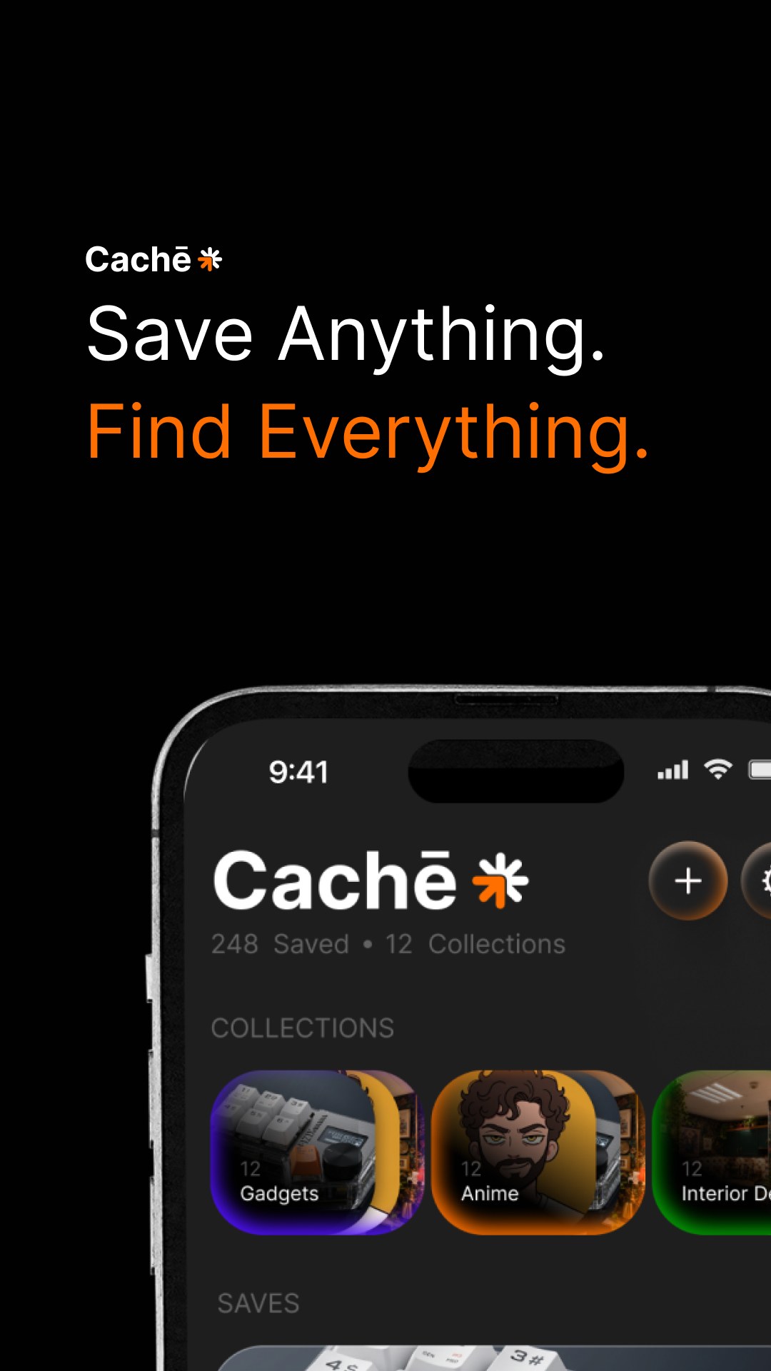
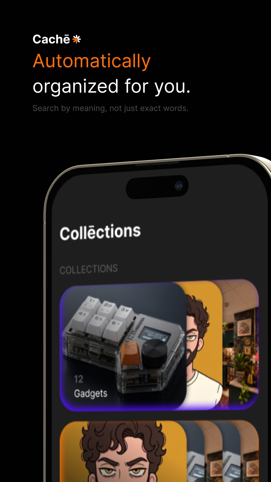
Under that row, the saves are a wall. The ones you have marked, and the ones that are still fresh, get to be larger. Those are the ones you are most likely to know on sight. A short note stays small. A play mark means a video. A small badge names Instagram, YouTube, or the site it came from. Norman's signifiers are why the card carries the picture and where it came from. You should know what you saved before you stop to read a label.
Along the bottom are three rooms. Search, home, and collections. Home sits in the middle, where the thumb already rests, and the room you are in wears the orange. Adding something, and settings, live up by the name. Small, there when you need them, quiet the rest of the time.
Filing can wait
A folder, in the second someone is trying to keep a link, is how the save gets lost. Hick's law is blunt about it. More choices, a slower decision, and then no decision. You have felt the stall. The list opens, you hesitate, the video is still playing, and the moment passes. So the app files the thing unless you say otherwise. The switch sits on the sheet. This one item can go to a collection you name, and then you leave.
The guess starts with the obvious clues. A recipe site lands with the recipes. A page that is clearly about a trip lands with travel. When the words are fuzzy, I would rather leave it sitting with the unsorted things than spread it across five collections. A wrong pile becomes a second mess. An unsorted save can wait until you care.
With the model on the phone, a save can grow a cleaner title and a short line about what it is. A small spark at the end of a title is how you know those words were written for you. I kept anything louder off the card. The save lands either way. Low battery, or the model never downloaded, and you still have the thing, with the title the page already had. The helpful part can fail. The keeping still happens.
You can move it. Edit opens the collections, and a wrong guess is a tap to fix. I cared about that more than I cared about the guess being clever. Nielsen calls it user control, and it is the reason a wrong pile has to be easy to undo. If the shelf files things and you can never put them right, you stop trusting where they went.
Find what you barely remember
This is the screen the rest of the app is for. The line on the frame is the promise. The question under it is the way a person actually asks. There was a fish place I wanted to go to. Which one was it. The answer leads with the reel. A plate, a hand. Then a short note about which of your saves it used. The question is a craving. The title is a headline. The search has to cross that gap, and it has to be visible, or nobody tries it a second time.
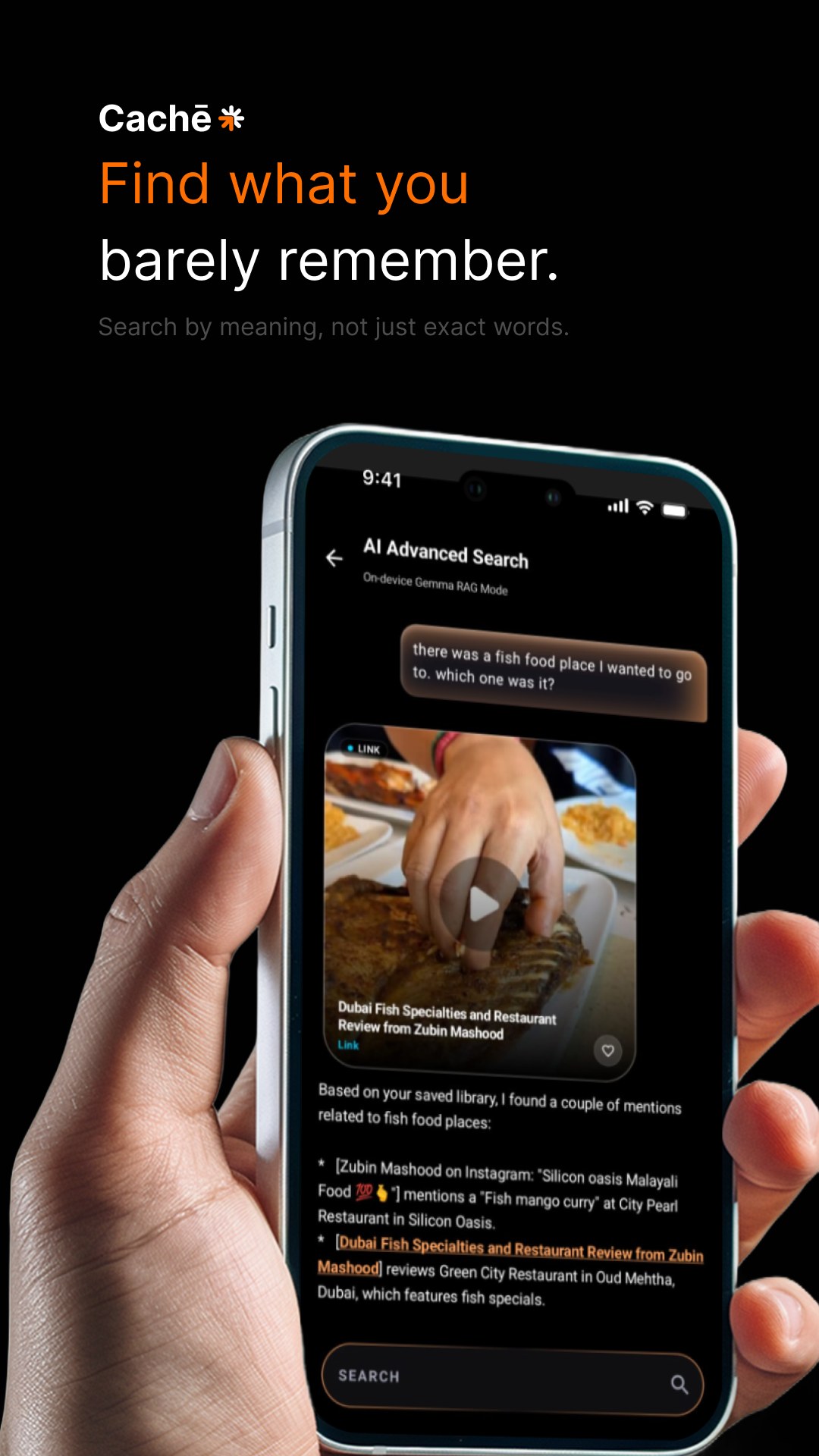
A memory gets stored under the day, under what you wanted, under where you were. The title of the reel is rarely the part that stays. Tulving called that encoding specificity. You find a thing along the path you laid it down by, so the search had to be willing to walk a messy path. One field for the word you still have, including a word that only exists inside a screenshot, like an order number in a photo. And another room, for the sentence you actually remember.
That second room tells you the truth before it starts. It is slower. It understands a question asked the way you would ask a friend. It runs on the phone, and it only looks through your library. You choose to walk in. I named the cost up front so the wait would feel like a tool you picked up, and a few quiet seconds would read as the search doing its work.
The result leads with the picture because you know it when you see it. The plate does the remembering. Nielsen called that recognition over recall, and it is the reason the title is allowed to sit quietly underneath. The lines under the picture are for when the picture is not enough, and they point at your own saves. You open the reel, the review, the note. The answer is a way back into the shelf.
Under the title of that conversation, in small type, it says the search stays on the device. People let a detail go once they trust that something else is holding it. Sparrow, Liu, and Wegner showed this with search engines, and a phone full of saved reels does the same thing every day. So the way back has to live on the phone, next to the library. Nothing here asks you to make an account. You can carry the whole shelf to another phone, or delete it.
Coming back to something old
A library that only grows is still a drawer. I wanted a reason to meet an old save again, and I wanted the reason to be mine. Early on there was a feed of forgotten saves, and a weekly nudge. Both came off the home screen. A ping you did not ask for, about something you saved for later, turns into noise, and noise is how an app teaches you to ignore it.
The loop I kept is a quiet one. The itch is the half-memory. Saving was cheap on the day you did it. The reward is the restaurant, the video, the note, and those live in other apps. Eyal's hook is useful here if the reward stays out there. What Cachē asks you to invest is the library itself, which is why the count sits under the name. A heart sets something aside as a favorite, and that is the whole gesture.
When you do want a nudge, you set it yourself. One item, one morning you pick. It fires once, with the title, and it opens the app. Gollwitzer called this kind of plan an implementation intention. When this morning comes, show me this. A vague intention to go through your saves fades in a week. One thing, tied to one morning, has a chance.
Share something that is already on the shelf and the sheet says so, with the title and when you saved it. A second copy happens only if you ask for one. The same video should stay one save, even when the address arrives in a slightly different shape.
How it goes
- From the app you are in, share it to Cachē. Where you have turned on the quicker tap, use that.
- The sheet shows the thing, files it unless you say otherwise, and sends you back.
- Home is the name, the count, the colored stacks, and a wall of things you can recognize.
- Search with the word you have, or ask in the sentence you have. That door tells you it is slower, and that it stays on the phone.
- Open it. Move it if the guess was wrong. Set a reminder if it belongs to a particular morning.
What I left out
I left out an account, and any feed of other people's taste. I left out a score for how organized you are, and the weekly tap on the shoulder. The first name I had for it was Oblivion. It described the feeling of losing something, and it was a poor word to put under a spark. The project folder is still called Back Pocket. The screen says Cachē. The dark field, the spark, the orange, and those four sentences stayed, because they were the part that was already right.